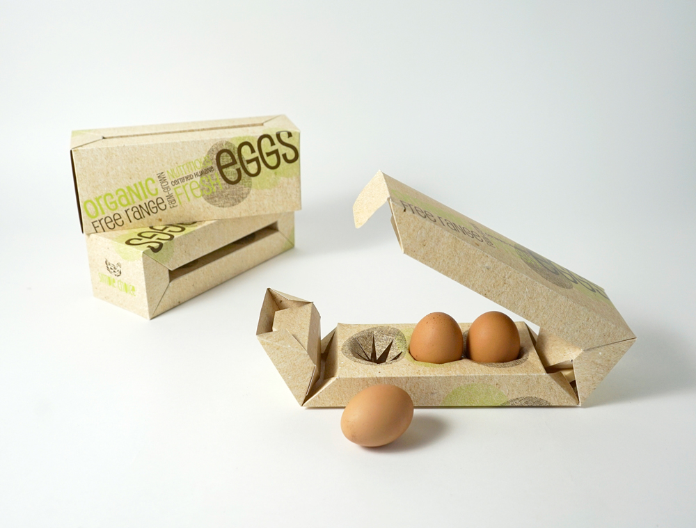
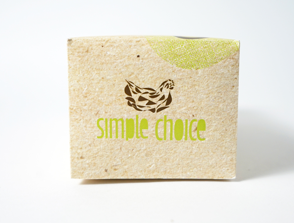
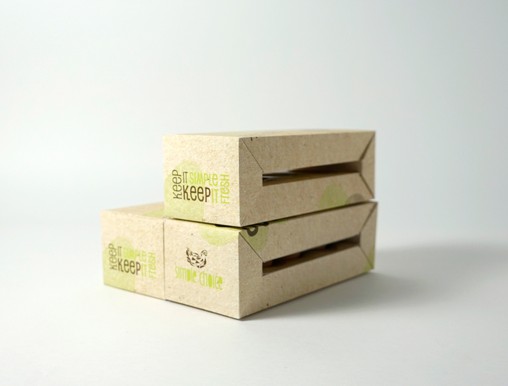
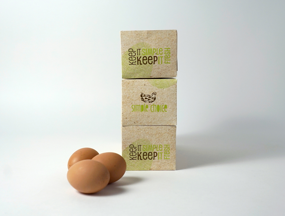
This packaging design was created in one of the design classes. The goal of this project was to come up with the packaging solution for three eggs. My design speaks to the “Whole Foods” customer. The one who would prefer organic farm-raised products which are more expensive. The brand I have created is “Simple Choice” Eggs which are organic farm-grown eggs produced by cage-free hens that are fed an organic wholesome feed. The main concept of the logo is derived from a simplified representation of a chicken. The symbol has geometric and organic aspects to it. It is simple in design in order to echo the name of the company “Simple Choice”. The egg patterns used throughout the package are based on the texture of the burlap fabric. The text serves as a decoration as well as a useful information for the customer. The typefaces used in the design have been chosen for its geometric qualities and playfulness. The choice of colors is echoing the environment hens are raised in. It is based on the green color of the grass and the brown color of the hens and the eggs they produce. These colors associate with nature and rustic feel of the farm.

 The Shape Of The Shadow
